CSS Grid based React component, comes with predefined values to ensure design consistency, and ease of use.
Table of contents
How to use Grid
The Grid consists of two components:
- Grid: Used as a container for GridItems
- GridItem: Elements within the Grid
## Code examples
columns
When defined as a number, it will split the space into equally sized columns; it also accepts any of the grid-template-columns css properties. e.g.
rows
Accepts a number or any of grid-template-rows css properties.
columnGap & rowGap
columnGap represents space between columns, rowGap represents the space between rows, both accepts one of spacing token names.
spacing2Xs | spacingXs | spacingXs | spacingS | spacingM | spacingL | spacingXl | spacing2Xl | spacing3Xl | spacing4Xl
e.g.
Grid Components
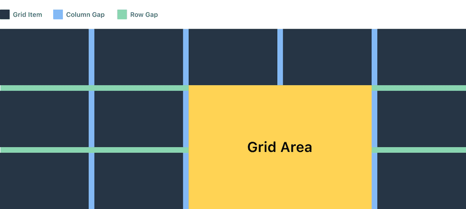
The grid layout consists of different components that helps defining your layout in two dimensional aspects, these components are:
Grid container: The main element that controls the layout structure, columns, rows, and the gap between them
Grid item: The children of the grid container.
Grid columns: The vertical container for children elements within the grid layout
Grid rows: The horizontal container for elements within the grid layout
Grid area: A space consists of columns and rows within the grid, and is controlled by the child element itself
Column gap: The space between vertical containers which corresponds to one of our spacing values
Row gap: The space between horizontal containers which also corresponds to one of our spacing values
Basic usage
Repeat notation
repeat() is a css notation that you can use with the gridColumns and girdRows properties to make your rules more concise and easier to understand when creating a large amount of columns or rows
Example: gridColumns={'1fr 2fr 1fr 2fr 1fr 2fr'} is same as gridColumns={'repeat(3, 1fr 2fr)'} see below.
FR unit
Fr is a fractional unit and 1fr is for 1 part of the available space. it differs from percentage unit because it distributes available space.
If you place a larger item into a track then the way the fr until will work is to allow that track to take up more space and distribute what is left over.
Span keyword
Span keyword works on grid items with the gridArea property, use span to avoid specifying the end lines for a column or a row.
i.e. instead of specifying columnStart and columnEnd you can use span to make the grid item take 4 columns
Content alignment
Just like flexbox the grid comes with justifyContent, justifyItems, alignItems, alignContent, ..etc.
Grid vs. Flexbox
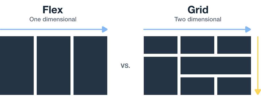
The main difference between CSS Grid Layout and CSS Flexbox Layout is that flexbox was designed for layouts in one dimension - either a row or a column. Grid was designed for two-dimensional layout rows, and columns.
Accessibility
According to WCAG C27 technique, the dom order must match the visual order.
The grid can re-order it's content in various ways through the order css property on grid items, this changes the visual order but the dom order stays the same, hence, keyboard navigation and focus order maybe affected.
Set the correct order of the elements with tabindex attribute to avoid accessibility issues.

